Cases
Santander Río
We designed a banking product acquisition process that is 4 times more effective.

In 2010, Santander Río bank needed to migrate the request for its products from the physical to the online channel. Up until that point, very few customers were willing to apply for credit cards online.

The reasons: low trust in the online channel and forms that required information users didn’t understand or weren’t willing to complete.
65%
Effectiveness
156%
Efficiency
4%
Satisfaction
Areas of work:
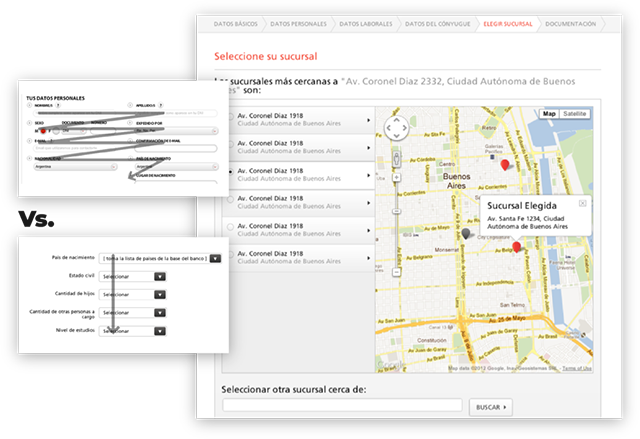
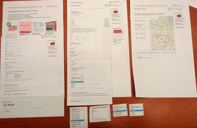
We redesigned all the application forms, following best practices in usability and accessibility.

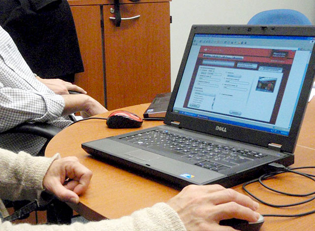
- Conducted UX Research to evaluate existing processes, user motivations and interests, opportunities, and areas for improvement.
- Redesigned the process for applying for credit cards and banking packages, following best practices in persuasion, usability, accessibility, and responsive design.
- Redesigned internal Knowledge Management systems.
- Conducted interviews with the Call Center to learn about best sales practices, which were then applied to upselling processes.

